Before making my advert I looked online for some inspiration and found two posters that I found interesting, the poster for the film "Toad Road" and a fan made poster for Bob Dylan, which are below:


I then took the picture below as a foundation for the advert:

I opened Photoshop in order to edit my advert, I made the canvas the size of an A4 sheet as that is the size I intended my poster to be:

After adding a rectangle to make the background green I added a pattern overlay effect. This pattern included leaves as it would link to the nature seen in my music video.

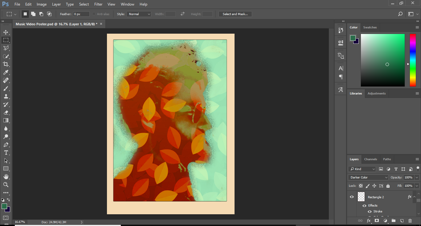
After this I added in the photo I took and cut around it, I then began by adding a colour overlay.

I went on to further edit the image in order to try and make it stand out more. I added the leaf pattern overlay again, to again link to my music video. I added a gradient overlay to the image which helped me by allowing me to apply gradient-based effects onto the image. After this I added an outer glow effect which I believe made the image more artistic. I then finally made the image blending mode a darker colour.

I added a border to the image which allowed me to put the band name and other information on the poster. The border was then added with the effect of stroke and colour overlay.
I added the band name and additional information to the top and bottom of the border, respectively. With the text I used the font 'Roboto', which I downloaded off DaFont.com, as I believed it suited the tone of my video.

Finally I added the title of the album to the advert. I made sure to make it stand out by having it right in the middle of the advert and in huge text size. I used the Bebas Neue font, which was again downloaded off DaFont.com, and applied the hard light effect to the text


No comments:
Post a Comment